Daily chart lesson · 2026-10-14
How a Daily Candle Forms: 8 Paths on the 15-Minute Chart
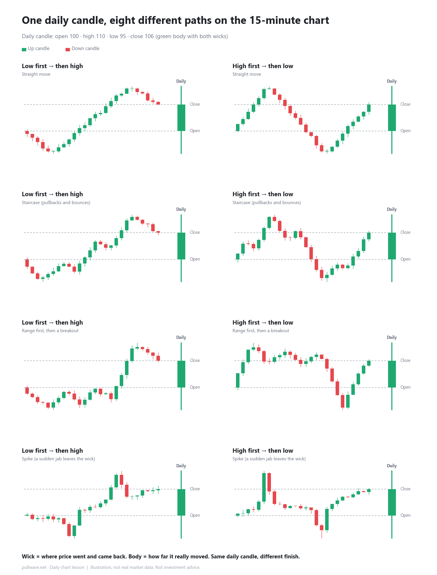
At a glance
- A daily candle keeps only four prices — open, high, low and close — and erases the path between them.
- Every intraday path falls into 2 orders (which extreme came first) × 4 travel styles.
- A wick is where price went and came back; the body is how far it really moved.
A daily candle stores only four numbers: open, high, low and close. Everything that happened in between is gone. When you open a lower timeframe such as the 15-minute or 5-minute chart, you can see that the exact same daily candle can come from very different days.
Two questions classify every path
There are endless possible intraday paths, but structurally they all answer two questions.
1. Which extreme came first?
Price starts at the open, must touch the high and the low once each, and ends at the close. So there are only two orders.
- Low first → then high: price dips first and leaves the lower wick, rallies to the high, then gives some back and leaves the upper wick.
- High first → then low: price spikes first and leaves the upper wick, sells off to the low, then recovers into the close.
2. How did it travel in between?
- Straight move: one direction, many candles of the same color in a row.
- Staircase: rise, pull back, rise again — a visible wave of higher lows and higher highs.
- Range, then breakout: most of the day spent in a box, then one push that builds the wick and the body together.
- Spike: one or two candles jab out and snap back, and that jab becomes the long wick.
Two orders times four styles gives the eight panels in the picture. Every panel ends in the same daily candle on the right.
How to use it on a real chart
The daily candle is the same, but the finish is not. A low-first day ends while drifting down from its high; a high-first day ends while climbing off its low. When you look at the next session, it helps to check which way the lower-timeframe candles were moving into the close, not just the shape of the daily candle. Opening the lower timeframe also tells you whether a long wick came from a sudden spike or from a breakout after a range.
Common misconceptions
- "A long lower wick always means a bounce": a wick only records that price visited a level and came back. Its meaning depends on the order and speed that built it.
- "A green candle means price rose all day": on a high-first day, price can fall for most of the session and still close green after a late recovery.
FAQ
Does the same idea work for 4-hour or 1-hour candles?
Yes. Every candle is built from smaller candles, so the same two questions — which extreme came first, and how price traveled — apply on any timeframe.
Which lower timeframe should I open?
Roughly 1/4 to 1/16 of the candle you are reading. For a daily candle, the 1-hour or 15-minute chart is common; for a 4-hour candle, the 15-minute or 5-minute chart.
General education, not investment advice. The picture is an illustration, not real market data.